
Friday, 14 November 2014
"Whoosh" gif
Year 2 - Project 1 - Games As Art
.png) |
| Dear Esther - This way, please. |
A Look At Narration
.png) |
| Dear Esther - Follow the light. |
It's not what I would deem a game. Dear Esther is a story, with a slideshow of gorgeous scenery after gorgeous scenery. You cannot alter the story by taking a more rebellious path. You have no heads up display, or true objective. Only the power of suggestion.
Not calling it a game is not, however, an insult. It's just healthier for a consumer to know what to expect. When you call something a game, you imply many things about the product. Things that Dear Esther does not have.
Upon listening to a full one hour walk-through of the novel, with no commentary, I came to enjoy the poetic writing of each chunk of narration. The metaphors of kidney stones and islands were striking. When my attention flitted back and forth from my sketchbook to the video, I gazed upon some truly beautiful scenery. Where the lighting was bleak and grey, it fit the tone of the story - and the atmosphere of England, generally. But then to be contrasted by the phosphorescent caves, covered in stalactites that created interesting breaks in dark and light. All tied together by the glassy reflections in the shallow water.
The screenshots I picked (above) from the start of the novel display some of the ways the environment lures the "player" through the narrative. The rocks (top) that have cascaded down the shallow cliff-face provide a safe walkway to the shore. And the distant red blinking light of a tower (bottom), only just visible over the rocks, serves as a constant suggestion as to where the "player" is to finish their journey. To make it more alluring, that's even where the sky breaks, letting through a biblical beam of light to guide your attention.
These practices interest me. For example, in your common action-adventure game, you are given waypoints to lead you to your next progressive point in the game's narrative. If you were to strip that away and only use these suggestive techniques, would the player be able to comprehend where to go - even whilst fighting the malicious AI? Or is this a strategy that can only be adopted by something like Dear Esther, where your attention is nearly never taken away from the environment?
.png) |
| The Walking Dead - Telltale Games |
Presenting your fiction through the 3D medium allows a new way to experience your story. For Dear Esther, it puts a reader in a far more clear cut vision of the writer's imagination. A more concise realisation of how the words should make you feel. For Telltale, it's to give the reader freedom of choice.
Wednesday, 24 September 2014
Year 2 - Induction
 |
| Brainstorm |
 |
| Getting back in to the swing of drawing - it had been a while |
Induction
Over the summer we were set the task of developing a character that resides in a post-apocalyptic world.I spent some time coming up with a way for the world to end. I brainstormed for a while until I snapped to the world losing the arms-race with bacteria. With that, I created a human male, tore off limbs - lost in an explosion - and replaced them with cool exoskeleton-esque appendages. I did this with gameplay in mind. I wanted a character that was justified to move very quickly and fall from great heights, since I enjoy good movement in video games (with a history of arena shooters - Quake, Shootmania: Storm, CoD4 Promod, Loadout).
The first task given to us upon returning to college this September was to draw up an orthographic of our character. This was something I needed more practice at, so was glad to be given the opportunity. I felt like it went alright, but taught me how difficult it is to stay accurate and true to an organic design when looking at it from different angles.
 |
| Some design thought in to the look of the prosthetic limbs |
 |
| Orthographic of male lead character |
Happy with that, I sunk my teeth in to Mudbox. I enjoyed working with it a lot more than physical clay, since the virtual tool-set was a nice crutch for my limited skill. And working with tablets allowed me to utilise my traditional drawing skill.
The exercises over the induction period have provided excellent opportunity to revive my work ethic, learn about form - particularly human, and how important it is to work from references.
 |
| Doodling more interesting shapes |
I am slowly learning that I need to increase the size of my sketches. Filling the page of a sketchbook will feel better without so much negative space.
 |
| Orthographic of Mudbox creature |
Here are some progressive screenshots of my work in Mudbox (below).
.png) |
| Save file 2 - cutting jagged lines |
.png) |
| Save file 5 - refining shapes and seems |
.png) |
| Save file 8 - adding teeth |
 |
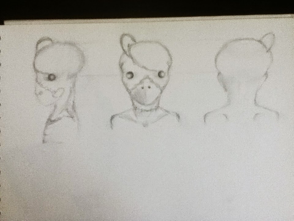
| Jar Jar Binks vs Admiral Ackbar + a meth addiction |
The John Wilkes Booth
Okay, so it's more of a classroom than a booth, but our lessons with Mr Wilkes have been enjoyable. With a more technical air to the atmosphere, each session feels like a work-out for our drawing hands. The first task was a reminder of perspective, a necessary exercise. Secondly, we had some still life drawings to do. A test of how well we can interpret what is in front of us, and then show on paper. Our mark-making techniques were strained.
However, my rebellious side shined through during the second task, as I grew tired of drawing the goat skull sat in front of me. I turned my POV (the back) of the goat's skull in to a hideous creature instead. With Mr Wilkes' permission, of course.
Subscribe to:
Posts (Atom)